What is Yamazumi Chart? What are the benefits of using Yamazumi charts for process improvement? Are you in search of answers to these questions? Then, you have come to the exact place.
This article will furnish you with all the details you need about Yamazumi charts and how to use them for process improvement. We will also provide some examples of how Yamazumi charts can improve productivity and efficiency in your workplace.
What is Yamazumi Chart?
Yamazumi is a Japanese word that means”to stack up.” A chart is a graphical representation that shows the cycle time of processes, like time and labor required to complete a process task.
This lean tool is strongly designed for quality control and reducing wastage. This stacked bar chart can compare different organizational processes, identify improvement areas, and monitor progress over time.
Organizing data in the form of a Yamazumi chart allows managers to quickly identify which tasks are taking up too much time, resources, or money and which are efficient.
Uses
Manufacturing process optimization
The chart can identify which steps within a manufacturing process are taking up too much time or resources, allowing managers to make changes that will reduce costs and increase efficiency.
Workflow improvement
It can also improve the flow of information within an organization, allowing team members to easily see which tasks are taking up too much time or energy.
Project planning
This chart can be used in project management, allowing managers to plan each process step and anticipate potential problems. For example, suppose a company is introducing a new product launch.
In that case, a Yamazumi chart can identify potential bottlenecks in the launch process, allowing managers to devise solutions.
Performance tracking
It can track the performance of different processes or tasks over time, allowing managers to identify areas for improvement easily.
Improve productivity
Yamazumi can improve productivity and efficiency within an organization by identifying areas for improvement or monitoring progress over time. For example, suppose a manufacturing process takes more time due to inefficient processes. In that case, a Yamazumi chart can be used to identify which methods are taking more time and how they can be improved.
Control over time and save cost
This chart allows users to pinpoint time-consuming activities and take action for efficient use of resources. No more wasting precious hours or money on tasks that don’t add value – instead, you can focus your investments on areas with potential payoffs.
Helps in line balancing
This chart is a powerful tool for optimizing the performance of your production line. It can help you identify overburdened or underutilized processes, compare cycle times between workstations and machines, and rebalance the process if the time changes.
This will lead to greater predictability in meeting customer demand consistently on schedule – ensuring increased efficiency throughout!
Helps in setting up continuous improvement (Kaizen mindset)
Businesses can visually display their process tasks to empower employees to strive for continuous improvement. This chart effectively motivates workers and keeps them focused on the end goal – ensuring that all stages add value.
What is Yamazumi Lean?
It is a methodology that combines the Yamazumi chart with various lean principles and concepts. The lean training method has been used in various industries to improve processes, reduce waste and increase efficiency.
- Yamazumi Lean aims to ensure that all steps within a process are well organized and efficient so that resources can be used more effectively.
- By using this approach, organizations can identify areas for improvement and make changes that will reduce costs and increase profits.
- It is particularly effective in manufacturing processes, where it can identify waste areas and ways to increase productivity.
Yamazumi Chart Creation Steps
Input the names of the steps
It means naming the process steps one after one accordingly; it is completely dependent on your production process.
Decide the cycle time
Time to be kept for each process and how much labor resource is required for each step.
Decide the color code for each step
Expressing each effort or time in a different color is easy to understand.
Yamazumi Chart Example
Here we are giving Yamazumi chart examples of the wind turbine generation process.
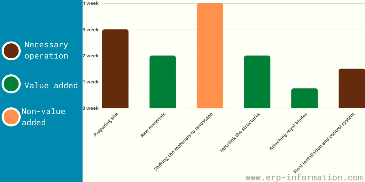
Preparing site
The construction of a wind farm starts with introducing new roads and providing access for transporting essential parts.
Raw materials
Purchasing the main raw materials required for a wind turbine. Example Tower, Nacelle, and the Rotor blade.
Shifting the materials to landscape
With precision engineering, the pieces of a steel tower are crafted in a factory before they take their grand journey to be put together.
Like building blocks, these parts come together with bolts and locks – all securely held fast until their final resting place atop the landscape is reached.
Interlink the structures
The carefully interlinked structure of a wind turbine is then brought together; its main drive shaft, gearbox, and blade pitch & yaw controllers are assembled onto the base frame before being covered by an elegantly bolted nacelle.
Attaching royal blades
Aluminum blades are held together through bolts, while wood glides along a craftsman’s blade.
Final installation and control system
Every fitting was perfectly placed, and cables were carefully routed from the nacelle to the utility box, then onward to a distant control center. This careful installation ensured everything worked harmoniously as one unified system.
How to Make a Yamazumi Chart Template in Excel?
This chart can be easily created using Microsoft Excel, making it an ideal tool for quickly creating visual representations of data.
- First, you will need to enter the time and labor required for each step into an Excel spreadsheet.
- Once done, the data can be plotted on a chart.
- To plot the data, select ‘Insert Chart’ from the menu at the top of the spreadsheet.
- A new window will appear with a selection of different types of charts. For example, select ‘Column’ and then click ‘OK’ to create a simple Yamazumi chart.
- Once the chart has been created, you can customize it by adding labels or colors to help make it easier to understand at a glance. You can also adjust the scale of the chart if necessary. Color-coded bars will represent steps or time, product name, etc.
- Finally, you can save the chart as an image file or print it out for further analysis and discussion.
Disadvantages
Although Yamazumi charts have many advantages, there are also some potential drawbacks.
- The chart may accurately reflect reality if the data used to create it is correct or complete.
- It is useful only when too many tasks are included in the chart.
- The chart does not consider any external factors influencing the data.
Conclusion
In conclusion, Yamazumi charts are a simple and effective tool for improving productivity and efficiency within any organization or project.
By using this, managers can quickly identify areas for improvement and plan for potential problems. Whether looking to improve processes or save time, resources, and money, Yamazumi charts offer an easy way.