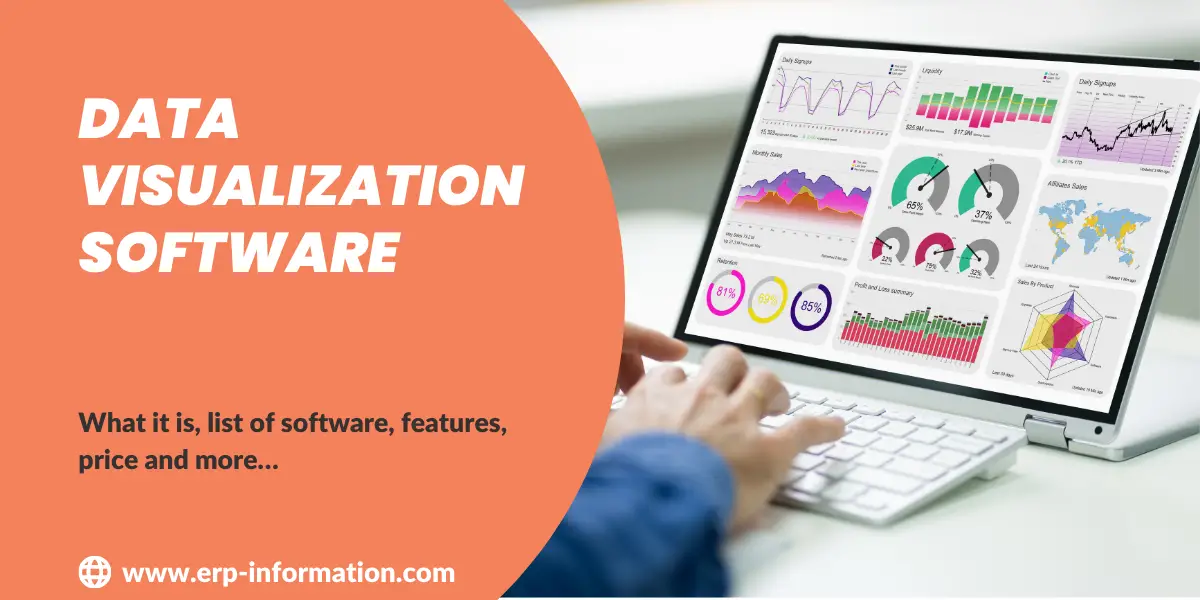
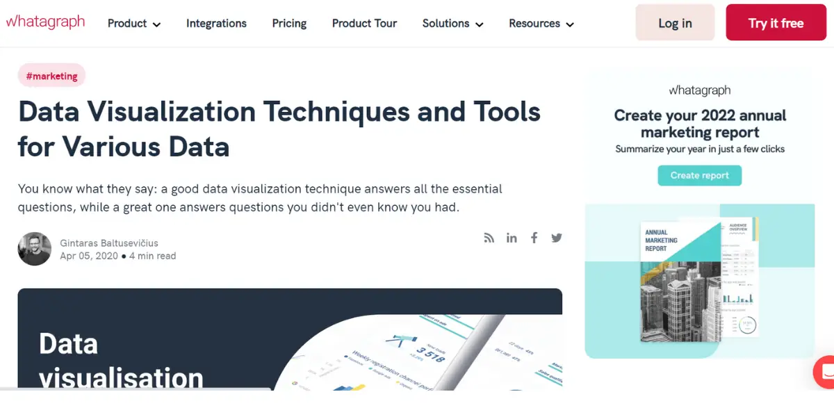
Many companies are in need of Data Visualization Software for internal analysis or as a part of their product. Data visualization is an essential tool for companies, individuals, and academics.
Data Visualization Software is used to analyze performance in different areas and adjust internal processes accordingly; this type of user relies on data-driven insights, which they can share through visual representations like charts or graphs.
This blog post will briefly introduce some of the best data visualization software. Then, you’ll learn about their features, pricing, and what users like/dislike about them before giving your opinion on which product might be right for you!
What is Data Visualization Software?
Data visualization software is the new way to make your data accessible, understandable, and engaging. With tools like charts or graphs, you can easily show non-technical audiences what’s happening in any given set of numbers without confusion.
There are two types of Data Visualization Software.
- Exploration: It helps you to find the story that the data is telling you
- Explanation: It tells the story to the audience
Below is the list of the ten best Data Visualization Software.
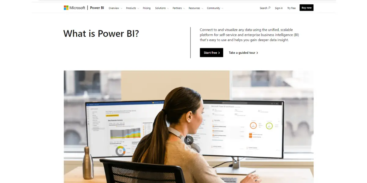
1. Microsoft Power BI
Microsoft Power BI is a platform for self-service and enterprise business intelligence (BI) to connect to and visualize any data. This platform is easy to use and helps you gain deeper data insight.
In addition, Microsoft Power BI data visualization software provides end-to-end data protection and interoperates with Microsoft technology.
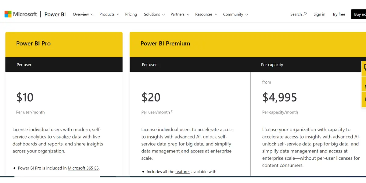
Pricing
A free trial is available.
- Power BI Pro: $10 per user per month
- Power BI Premium:
- $20 per user per month
- $4995 per capacity per month
Features
- Enables the creation of an amazing data experience with visualizing, modeling, and creating memorable reports.
- Biggest BI deployment that maintains data accuracy, consistency, and security
- Make confident decisions by empowering everyone in the organization
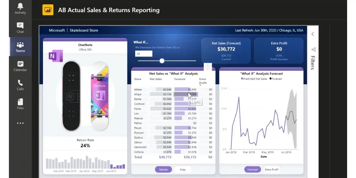
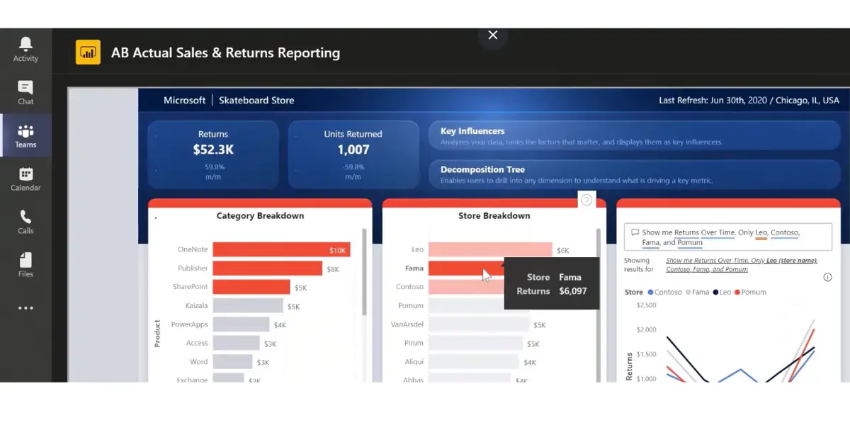
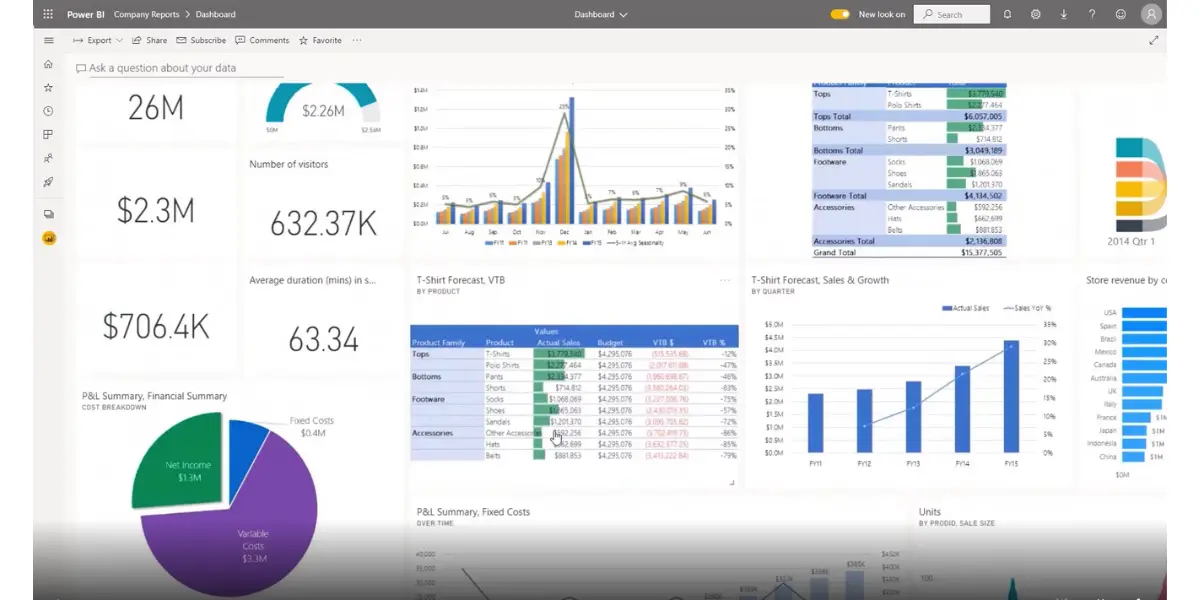
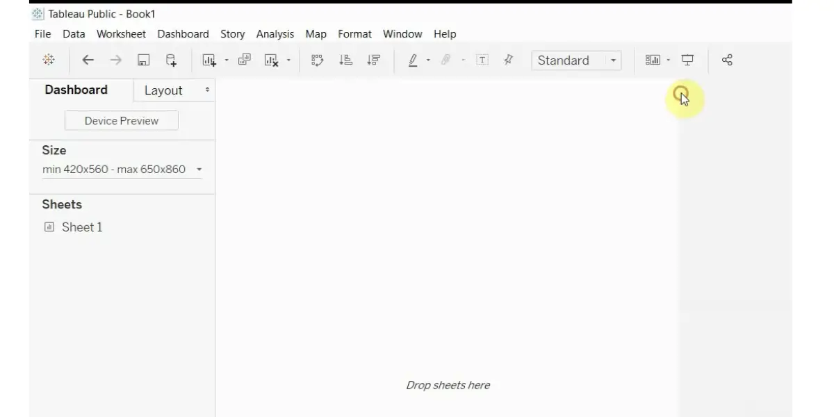
Some screenshots of Microsoft Power BI
Likes
- An easy-to-use tool with colorful visualization.
- More accurate data analysis and output.
- It makes it easy to organize data by importing it from Excel and getting it from other places.
- Options to select verities of visualizations and displays.
- Easily accessible on mobile phones and has good security features.
Dislikes
- It works only with a good chunk of RAM.
- It requires proper training or prior knowledge to create an advanced dashboard.
- Many users feel that it is not suitable for large data sets.
- The dashboard feels congested if you use several icons on the UI.
- Some users feel that the desktop app could be much faster.
- No option for collaborative work in the same file.
- Compatibility issues found with Mac.
Supported industries
- Energy
- Healthcare
- Manufacturing
- Media
- Retail
Other details
| Deployment | Cloud, SaaS, Web-Based |
| Supported device | Windows, Android |
| Support | Email/Help Desk, FAQs/Forum, Knowledge Base, Phone Support, 24/7 (Live Rep), Chat |
| Training | In-person, Live Online, Webinars, Documentation, Videos |
| Supported languages | Arabic, Bulgarian, Catalan, Czech, Danish, German, Greek, English, Estonian, Basque, Finnish, Hebrew, Hindi, Croatian, Hungarian, Indonesian, Italian, Japanese, Korean, Latvian, Lithuanian, Malay, Dutch, Norwegian, Polish, Portuguese, Romanian, Russian, Slovak, Spanish, Serbian, Swedish, Thai, Turkish, Ukrainian, Vietnamese, Chinese (Simplified) |
| Customer ratings | Capterra: 4.5 out of 5 (1152+reviews), G2: 4.5 out of 5 (38+reviews) |
User opinion
Microsoft Power BI creates unified and interactive data visualizations. It analyses and surveys your data and then shares it through dashboards and reports. In addition, it provides holistic AI and ML-based insights into the data to enhance your decision-making.
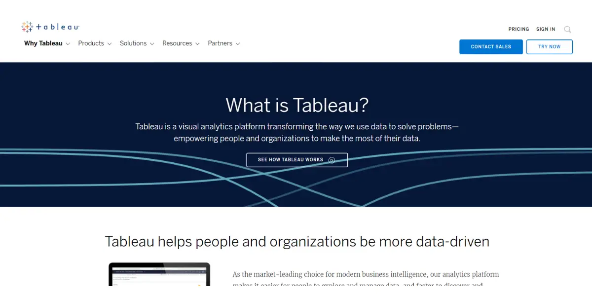
2. Tableau
Tableau is an analytics platform that is the best choice for modern business intelligence. It makes it easier for people to explore and manage data and discover and share insights faster.
Analysts, data scientists, business executives, and teachers use this software. The purpose is for the easy and powerful representation of data.
Pricing
A free trial is available. It offers three different plans
- Teams and organizations
- Individuals
- Embedded analytics
There are two ways to deploy Tableau. You can deploy this software with the cloud or via a server and choose the best option for you. The below options are to find your need for Tableau.
- Tableau Creator
- Tableau Explorer
- Tableau Viewer
Features
- Creates and develops the ‘Data Culture
- Builds the ‘Economy’: Ecosystem of customers, partners, and individuals
- Encourages to join the community
- Interactive dashboard for slicing and dicing datasets
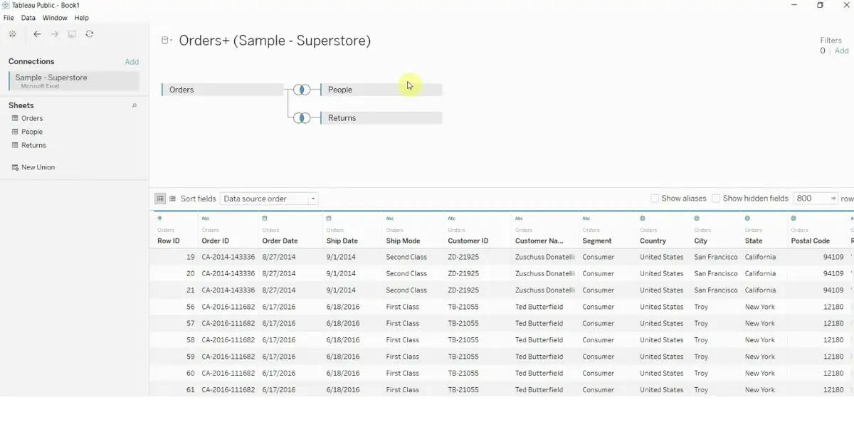
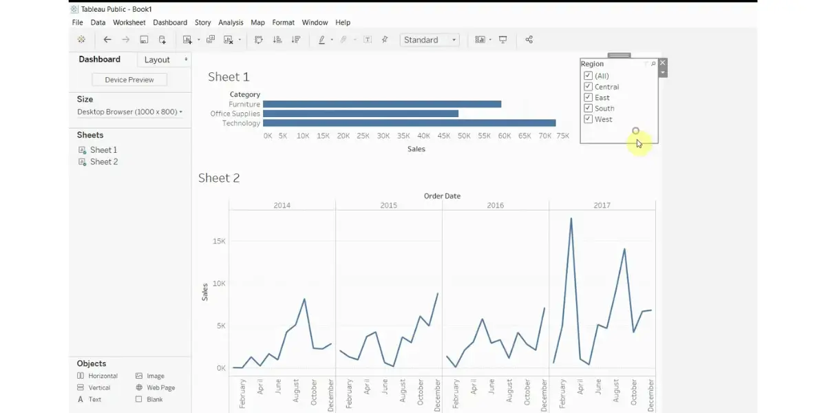
Some screenshots of Tableau
Likes
- Easy to create beautiful visuals and dashboards and narrate stories
- It reduces the data-cleaning work
- This allows using processed data in python and other analytics
- Anytime easy integration
- Good data validation
Dislikes
- It needs a technical background or training to work
- Selecting features for preparing visualization is difficult
- The license cost is a little expensive
- Inability to pixel-perfect PDF printing
- The data types are messy
Supported industries
- Financial Services
- Healthcare and Life Sciences
- Public Sector
- Retail and Consumer Goods
- Communications and Media
- Industrial Products
Other details
| Deployment | Cloud, SaaS, Web-Based |
| Headquarters | Seattle, Washington, United States |
| Supported device | Mac, Linux, Windows |
| Support | Email/Help Desk, FAQs/Forum, Knowledge Base, Phone Support, 24/7 (Live Rep), Chat |
| Training | In-person, Live Online, Webinars, Documentation, Videos |
| Supported languages | German, French, Japanese, Korean, Portuguese, Spanish, Chinese (Simplified) |
| Customer ratings | Capterra: 4.6 (1941+ reviews), G2 : 4.5 (2019+ reviews) |
User opinion
To make its customers more data-driven, Tableau is changing the way people comprehend their data. The platform offers intuitive visual analytics to resolve issues faster and is amongst the best data visualization and business intelligence tool used for reporting and analyzing large data.
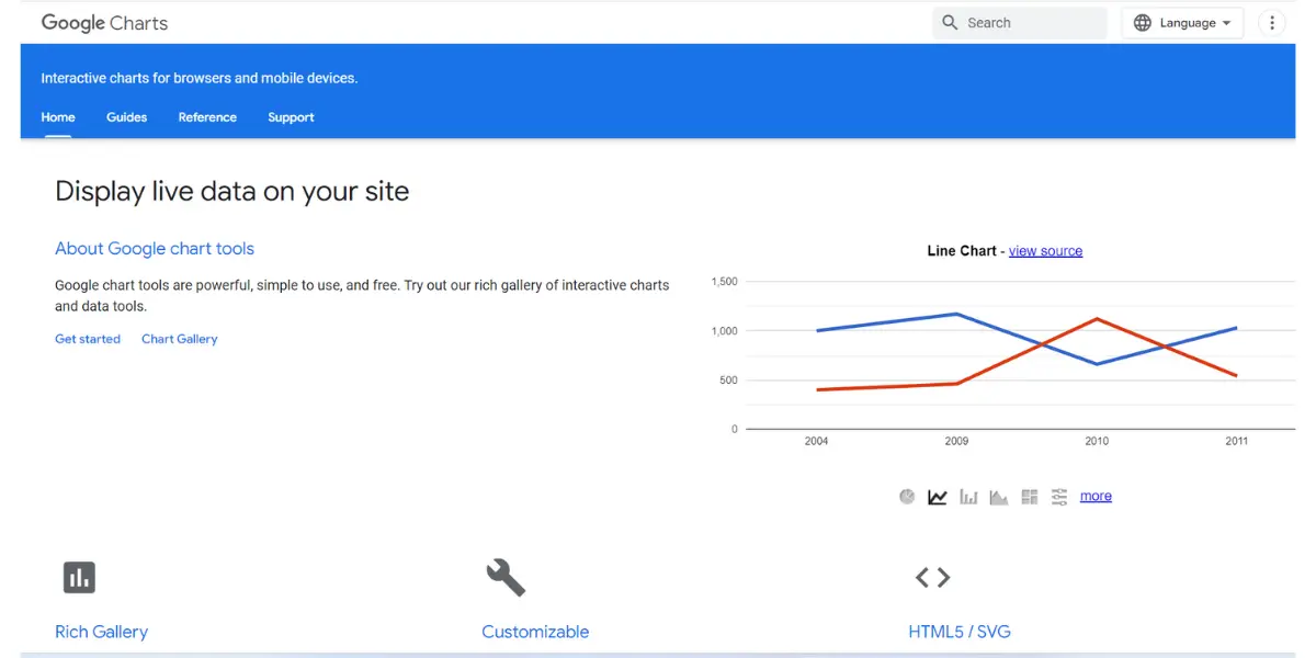
3. Google Chart
The chart gallery is another leading providing a large variety of ready-to-use charts, from simple line drawings to complex hierarchical tree maps! In addition, charts are exposed to Java script with customizable options.
Pricing
Pricing details are not available. You need to contact the vendor directly.
Features
- Rich gallery with multiple chart options
- Easily configurable options
- Cross-browser capacity
- Easily controls into an interactive dashboard
- Dynamic data in real-time
- Free for three years for google users
Screenshot of Google Chart

Likes
- Google offers free chart tools compatible with data
- Smoothly works with other Google apps
- Easy to implement with JSON dataset
- Easy to customize and completely free
- It is flexible and easy to use
Dislikes
- Only accessible with online data means need an internet connection.
- Some users feel that there is a lack of charts for granular presentation.
- Sometimes Google changes its APIs without notification.
- Customization of the chart by using coding is problematic for inexperienced users.
- Poor customer support.
- No desktop applications.
- Loading data sources is not straightforward.
- It does not support rich and complex analytics.
User opinion
Google Charts is one the simplest and most reliable data visualization platforms. It offers several interactive templates, tools, charts, pictographs, and more to get in-depth insights into analyzing data.
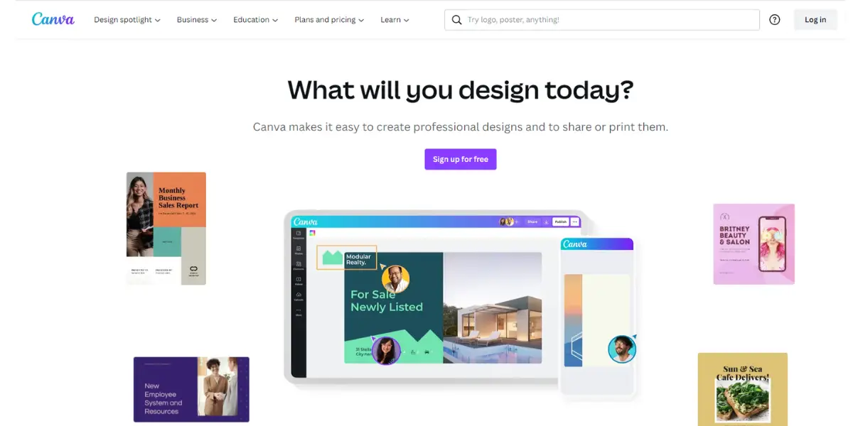
4. Canva
Canva is one of the leading data visualization software in the market, which provides many options for creating images, graphs, diagram templates, charts, infographics, etc.
This is mainly used by students and teachers for educational purposes and by businesses for activities such as media and publishing, real estate, healthcare and fitness, technology, sports, and many more.
Pricing
- Canva free version is available.
- Canva pro: for $119.99/year for one person.
- Canva Team: Team pricing is 12.99/month for 5 people; any additional member means $7/month.
Features
- Custom brand templates can be shared with the team.
- Easy brand management solutions
- Managing the contents with an unlimited folder option
- Streamlining the creative projects
- Single sign-on security for organizations
- Easy integration with other apps
- Increases creative work and team productivity
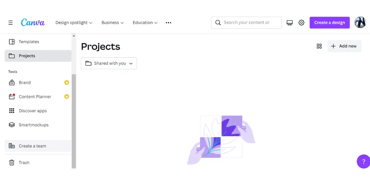
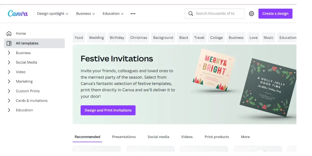
Some screenshots of Canva

Likes
- A beginner can also customize the templates.
- You can use it to change photographs and brand material for social media.
- You can also use templates to create progress reports.
- Endless features and functionalities help for a more creative presentation.
- The pro version has a huge resource library; the free version is also more useful.
- Easy to create website address.
Dislikes
- The collaboration feature is not included in the Pro version and is expensive.
- The video editing feature is limited.
- You can only get a PDF or an image when you download a template with customized information. If you want to make changes, you must return to the tool.
- When you download multiple files, they are automatically compressed into a zip file. The whole set of files downloads as a single file.
- Designs can not be edited offline
- Difficult to put music in videos from another source
Other details
| Deployment | Cloud, SaaS, Web-Based |
| Supported device | Mac, Linux, Windows, Android, iPad, iPhone |
| Support | Email/Help Desk, FAQs/Forum, Knowledge Base, Chat |
| Training | Webinars, Videos |
| Supported languages | Afrikaans, Arabic, Assamese, Azerbaijani, Belarusian, Bengali, Bulgarian, Cebuano, Czech, Welsh, Danish, German, Greek, English, Estonian, Basque, Finnish, French, Galician, Gujarati, Hebrew, Hindi, Croatian, Hungarian, Armenian, Indonesian, Italian, Javanese, Japanese, Kannada and more then 20+ languages |
| Customer ratings | Capterra: 4.7(10744+eviews), G2: 4.7 (3739+ reviews) |
User opinion
Canva is one of the simplest uncomplicated graphic design tools available online. It aids in creating a large assortment of data visualizations like posters, videos, social media posts, and more.
In addition, it offers a variety of design tools and templates that are required for you to use to prepare effective visuals.
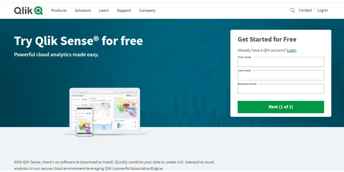
5. Qlik Sense
The Qlik Sense data visualization software helps you improve your skills and make data-driven decisions.
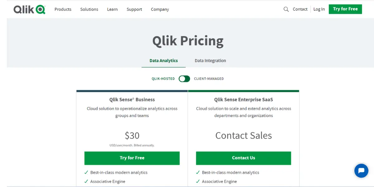
Pricing
- Qlik Sense business: $ 30 per user per month billed annually.
- Qlik Sense Enterprise: Contact the vendor directly for details.
Features
- Creates and shares Interactive dashboards
- Easily combine, visualizes, and explore the data
- Immediate alerting and automation
- Search and conversational analytics
- Easily schedules the reports for distribution
- Interactive offline analysis and integrated alerting
- Custom and Embedded
- Advanced analytics
- Interactive offline analysis and easy exploration on any device
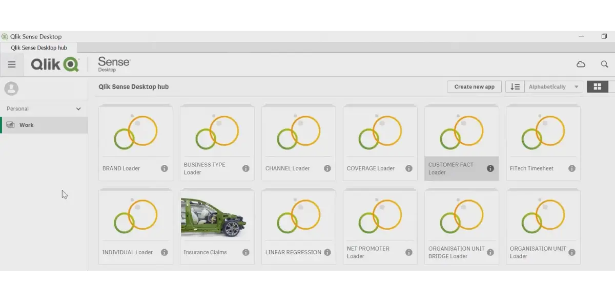
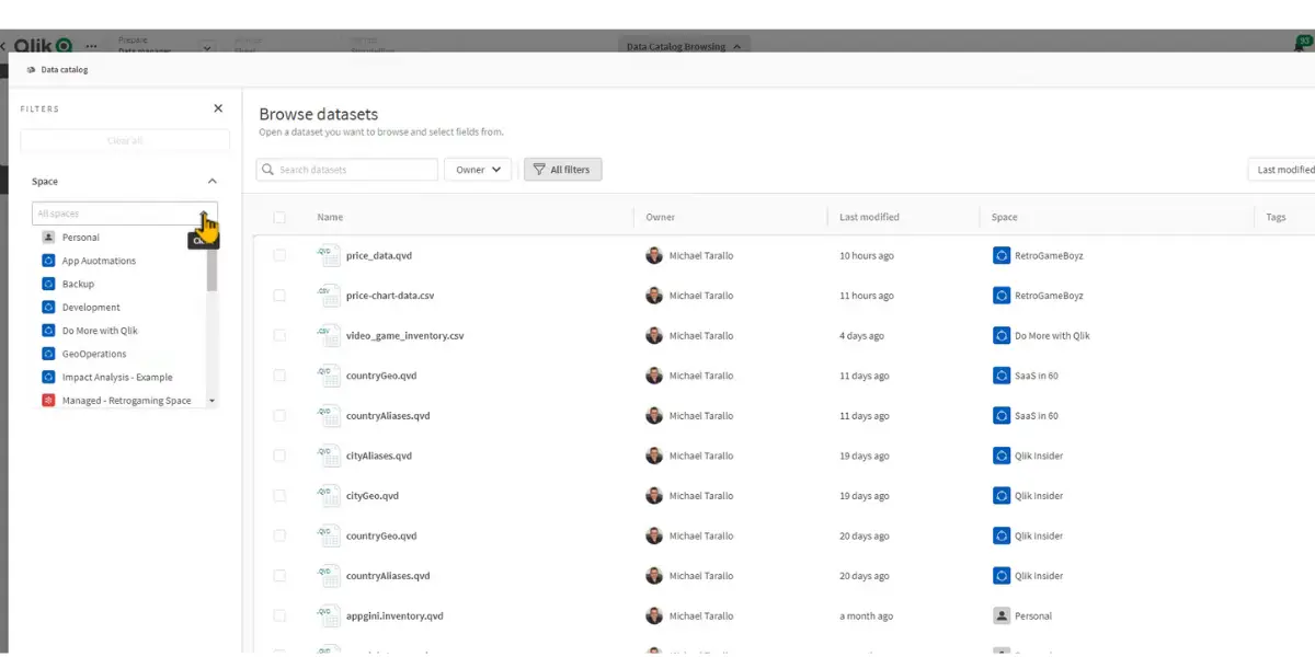
Some screenshots of Qlik Sense
Likes
- Powerful and easy-to-use tool.
- Attractive visualization and easy-to-read scripts.
- The database integration enables the user to leverage their existing skills in writing code while being more creative with how they flow data.
- Easy integration and data are linked.
- It provides a good place for businesses to work with customizable and expandable APIs. Businesses can also use big or small data, and they can use a multi-cloud platform.
- Turning a template into a chart showing different information is easy. You can also filter data on the chart.
Dislikes
- The cost of the product is high.
- It doesn’t include all the features, so additional features must be purchased.
- Sometimes it has an issue with loading data.
- Working with many data columns or putting too many formulae into a statement will restrict what you can see.
- Only limited data modeling and navigation features are available.
- The system crashes due to more considerable-sized data processing.
- The processing is affected due to poor internet connectivity and server down issues.
- Financial Services
- Manufacturing
- Healthcare
- Consumer Products
- Public Sector
- Energy Utilities
- US Government
- High Tech
- Retail
- Life science
- Communications
Other details
| Deployment | Cloud, SaaS, Web-Based |
| Supported device | Mac, Windows, Linux, Android, iPhone, iPad |
| Supported languages | German, English, French, Italian, Japanese, Korean, Dutch, Polish, Portuguese, Russian, Spanish, Swedish, Turkish, Chinese (Simplified) |
| Support | Email/Help Desk, FAQs/Forum, Knowledge Base, Phone Support, 24/7 (Live Rep), Chat |
| Training | In-person, Live Online, Webinars, Documentation, Videos |
| Customer ratings | Capterra: 4.8 out of 5 (208+reviews), G2: 4.5 out of 5 (665+reviews) |
User opinion
Qlik Sense is a platform that allows you to make better decisions that are data-driven and take the right actions accordingly. This is possible through AI-generated insights, which help in accessing your data.
In addition, Qlik Sense provides several tools such as charts, dashboards, and apps to understand data and overcome issues to put forth some intelligent work.
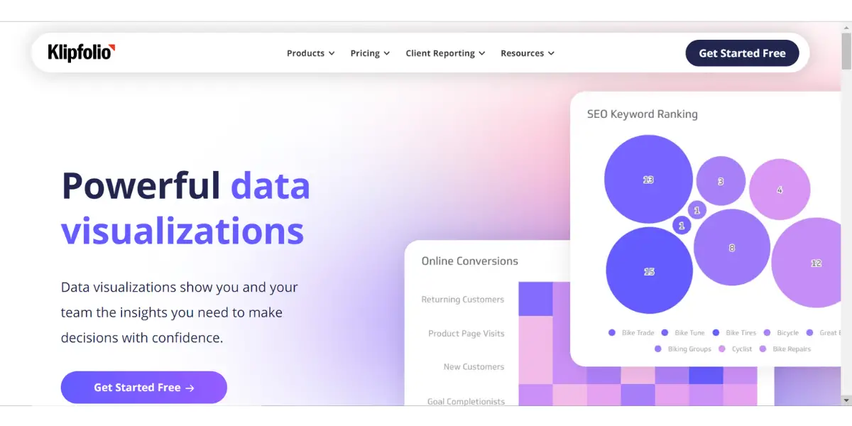
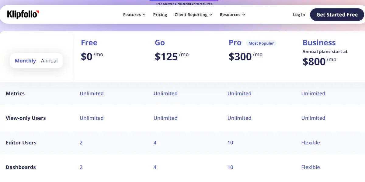
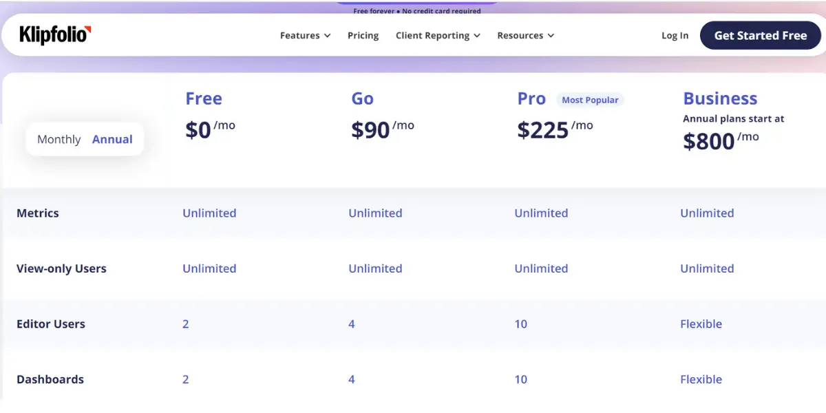
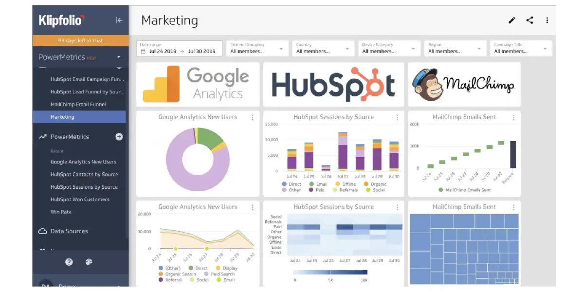
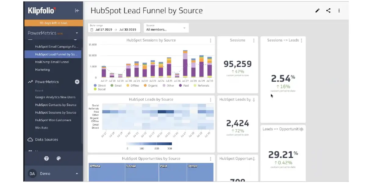
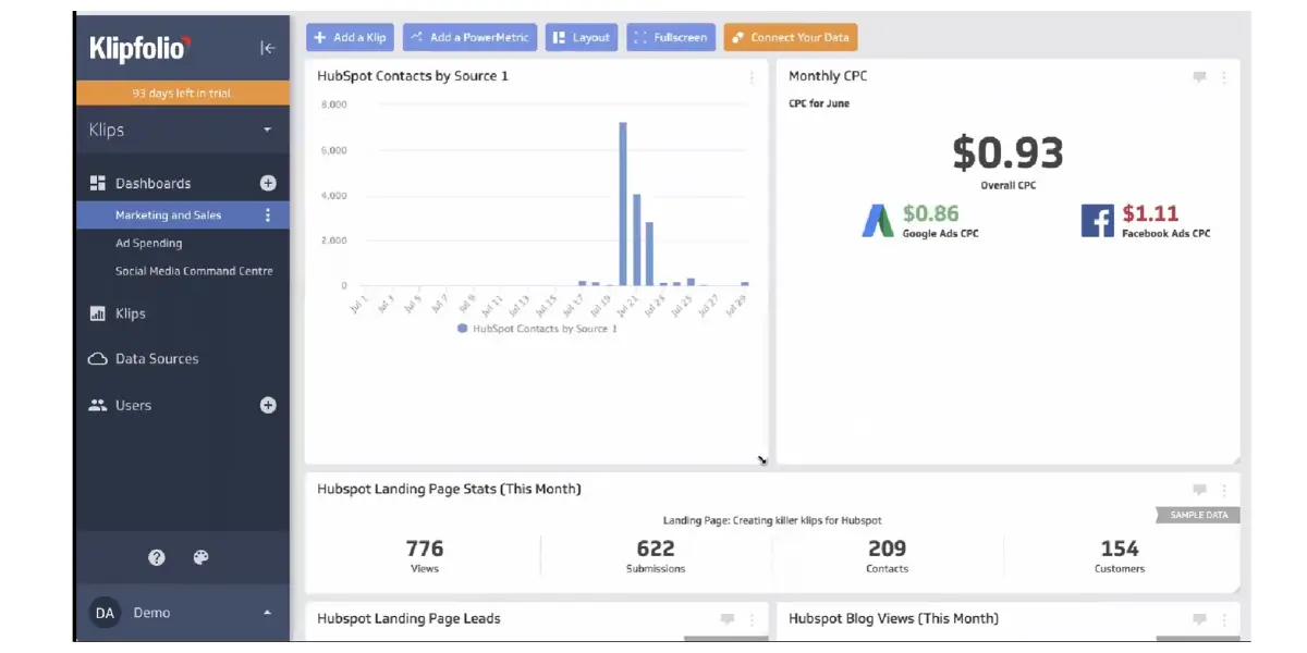
6. Klipfolio
Data visualization software Klipfolio is a great tool for dashboard development and making data-driven decisions. It allows you to expressively see the metrics from different data sets to understand better what is going on.
The available charts are easy to use and customize, and the colors can be changed to suit your needs. As a result, Klipfolio can be the best tool for anyone who wants to make better data-based decisions.
Pricing
- 14 days free trial is available.
- For Business
- Grow: $125 per month and $90/per month(Billed annually)/15 dashboards
- Pro: $300 per month and$225/month(Billed annually)/30 dashboards
- Business: $800 per month for annual plans
Features
- Quick visualization of metrics at your fingertip
- Self-serve exploration
- Many customization options like a different color option, chart types, multi metrics, segments, and filters
Some screenshots of Klipfolio
Likes
- Klips can have multiple graphs from different data sets, displayed side by side or together.
- Variables are easy to understand and can be changed without affecting the data. This makes them perfect for solving a wide variety of UI problems.
- It provides accurate information on metrics and business performance.
- It has a user-friendly interface.
- Easily connected with databases, Excelsheet, and Google Sheets.
- Integrations are very smooth and easy.
Dislikes
- Sometimes the user feels that the platform is a little slow while performing complex actions.
- The dashboard is slow to load, even when you use the default settings.
- You will need a developer to make custom visualizations or connect data sources.
- Instructional materials are out of date.
- It doesn’t correlate to the most current product available.
- High learning curve
- Fewer templates available
- Dashboards with custom date filters are slow to load
Other details
| Deployment | Cloud, SaaS, Web-Based |
| Headquarters | Ottawa, Canada |
| Supported languages | English |
| Support | Email/Help Desk, FAQs/Forum, Knowledge Base, Phone Support, Chat |
| Training | Live Online, Webinars, Documentation, Videos |
| Customer ratings | Capterra: 4.7 (180+reviews), G2: 4.5 (252+reviews) |
User opinion
This is a robust platform to assist you in making smart business decisions. It offers data visualization tools such as dashboards, data connectors, reports, data monitoring, and more for you to keep in control and result in effective operations.
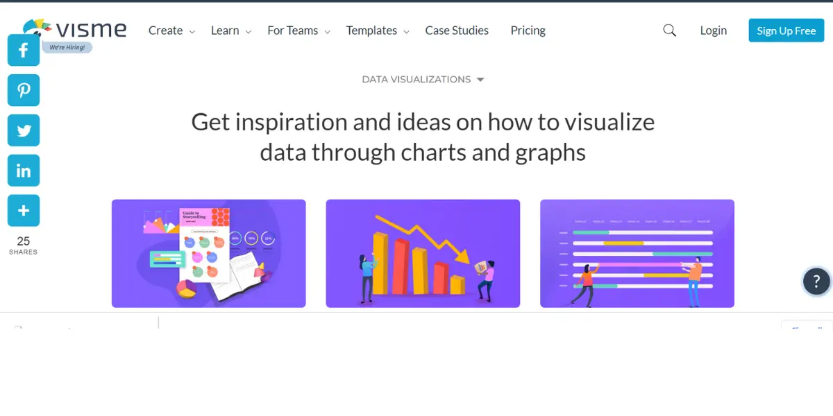
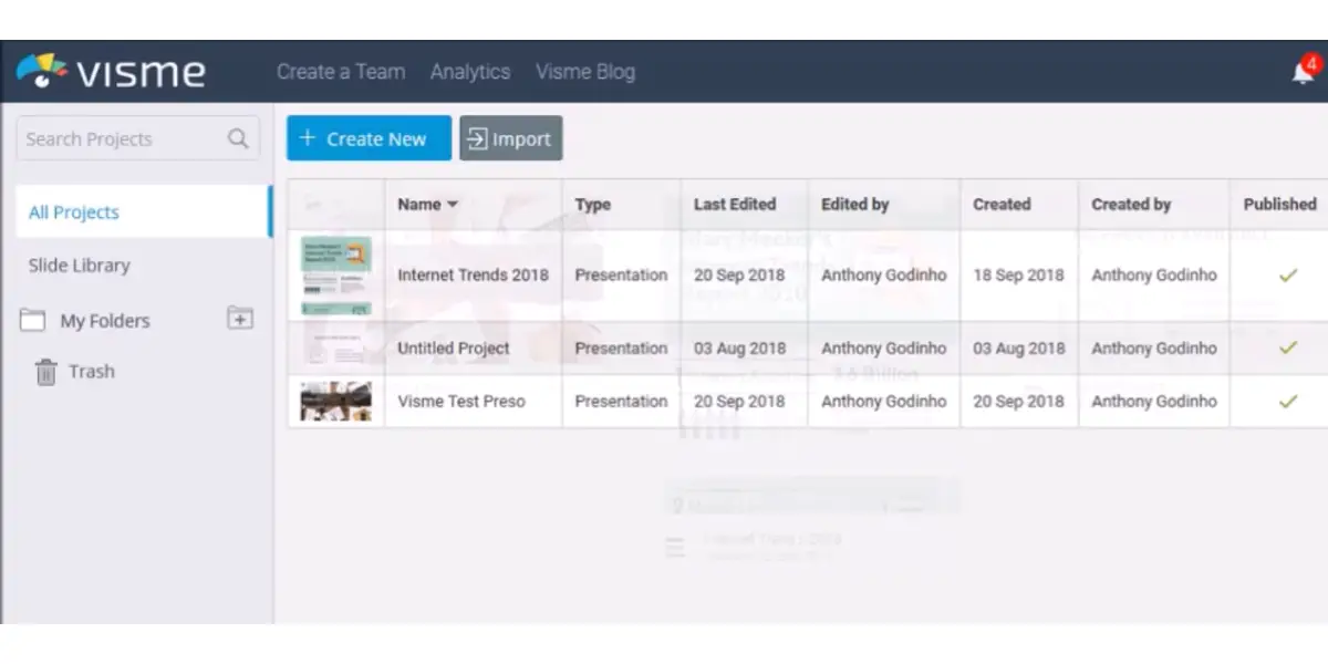
7. Visme
Visme is a web-based digital data visualization software that includes many tools for professional and amateur designers in academia, industries, marketing, and others.
Visme data visualization software offers several tools like presentations, documents, visual reports, graphs, charts, and others to revamp composing, sharing, and producing effective infographics and visualizations.
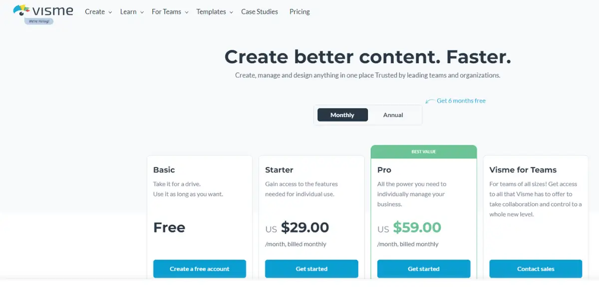
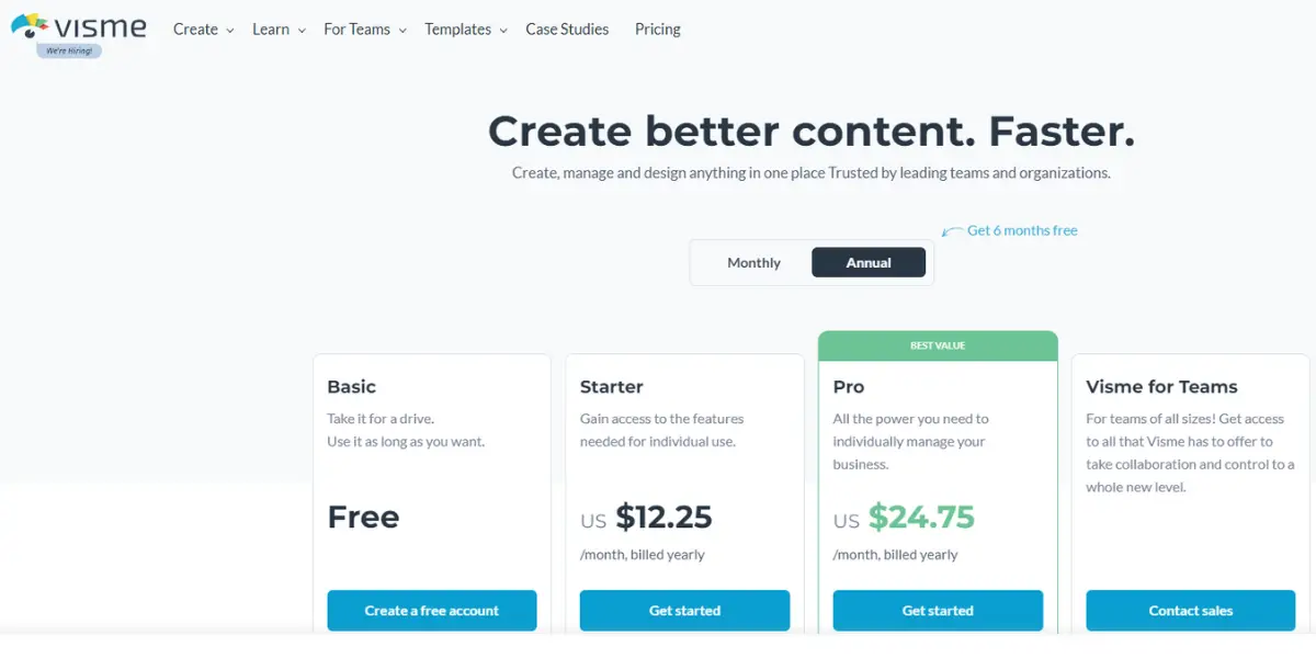
Pricing
- Basic version: Free
- Starter version: For individuals, $29 per month / monthly plan
- $12.25 per month / yearly plan
- Pro version: For businesses, $59 per month / monthly plan
- $24.75 per month / yearly plan
Features
- Collaboration in real-time
- Clear cut communication
- Managing assets and designs
- Activity tracking
- 3-D objects, CAD tools, animation
Screenshot of Visme
Likes
- Provides finest end products
- You can work offline too
- Creative templates available
- Quick and easy to work with
- Good tutorials and videos
- It is an all-in-one platform empowering non-design professionals.
Dislikes
- More customization to animation tools
- Limited analytical features
- Expensive upgrades
- Buggy behavior inside the editor and during the presentation
- Non-refundable Pro package
- Often face errors with formatting and layout customization
- Huge learning curve
- Poor customization
Other details
| Deployment | Cloud, SaaS, Web-Based |
| Supported languages | German, English, French, Italian, Latin, Russian, Spanish |
| Support | Email/Help Desk, FAQs/Forum, Knowledge Base, Phone Support,24/7 (Live Rep), Chat |
| Training | Live Online, Webinars, Documentation, Videos |
| Customer ratings | Capterra: 4.5 out of 5 (690+reviews), G2: 4.5 out of 5 (268+reviews) |
User opinion
Visme is an intuitive cloud-based software that allows anyone, from amateurs to professionals, to communicate compellingly through absorbing presentations.
It will enable you to create effective visuals through presentations, infographics, videos, and more on a single platform.
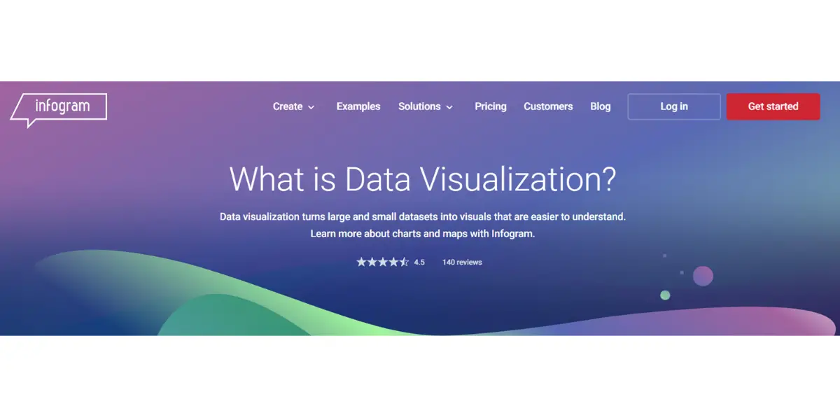
8. Infogram
Infogram is yet another platform that aids in creating web-based infographics and data visualization that are interactive infographics, reports, social media posts, dashboards, and more.
Infogram data visualization software helps people reach out effectively with clarity and appeal. It caters to academia, businesses of all sizes, marketers, journalists, and many others.
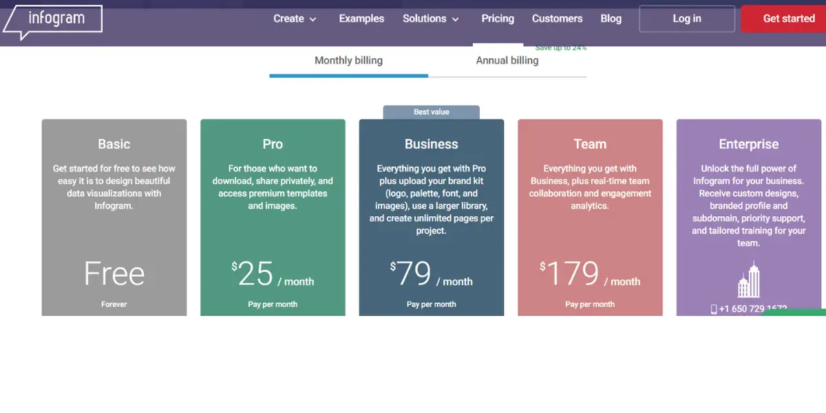
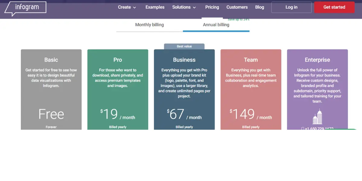
Pricing
- Basic version: Free
- Pro version:$ 25 per month for a monthly plan
- $19 per month for a yearly plan
- Business version:$79 per month for a monthly plan
- $67 per month for the yearly plan
- Team version: $179 per month for a monthly plan
- $149 per month for a yearly plan
- Enterprise version: Contact the sales director for further details
Features
- Interactive tools like charts, graphs, maps, and others to create visualized content
- Customized and ready-to-use design templates
- Unlimited access to high-quality, royalty-free stock photos, icons, GIFs, flags, and more
- Easy-to-use and intuitive data editor
- Easy import of data
- Download the created data visualizations in high-quality PNG, PDF, or GIF formats to share on social media or embed using our interactive HTML option.
- Interactive tools like charts, maps, reports, and more.
- Team collaborations
Likes
- A variety of tools and templates are offered
- Easy-to-use interface
Dislikes
- Alphabetic sorting of folders is not possible
- Cannot create subfolders
- Professional designers can find it limited
- Can handle visualizations for a limited data set
- Limited tools and sources on the basic version
Other details
| Deployment | Cloud, SaaS, Web-Based |
| Supported languages | English |
| Support | Email/Help Desk, Phone Support, Chat |
| Training | Live Online, Webinars, Documentation |
| Customer ratings | Capterra: 4.5 (66+reviews), G2: 4.7 (164+reviews) |
Supported industries
- Marketing
- Education
- Media
- Non-profit
- Government
- Reporting
- Teams
User opinion
Infogram is an intuitive platform that allows people and teams to prepare engaging data visualization content. It helps create infographics, reports, dashboards, maps, charts, and social media content. It is easy to use and inventive in design and making it a platform of choice for people in different professions to adopt.
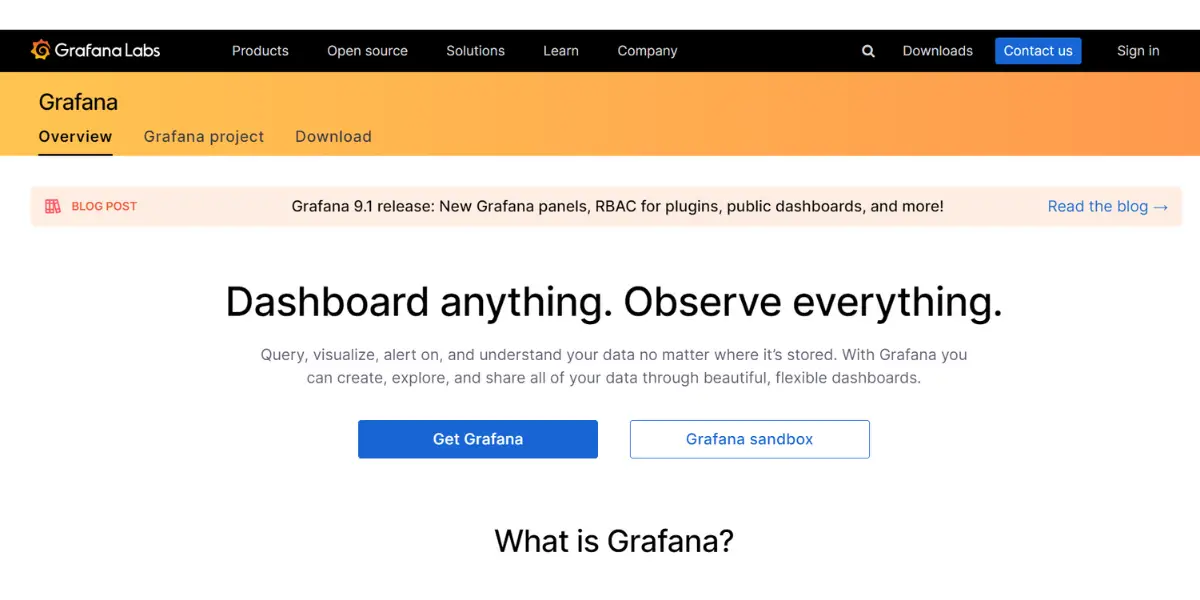
9. Grafana
Grafana is an open-source analytics and interactive visualization web software. It helps in the smooth movement of data amongst the team members through effective visualizations and engaging dashboards.
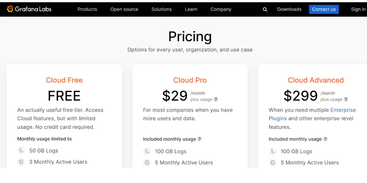
Pricing
- Cloud free: Up to 50 GB Logs
- Pro: It starts from $29/month
- Advanced and Enterprise: It starts from $299/month
Features
- Unifying your existing data
- Data accessibility
- Productive dashboards for collaboration and transparency
- Create flexible and versatile dashboards (customization)
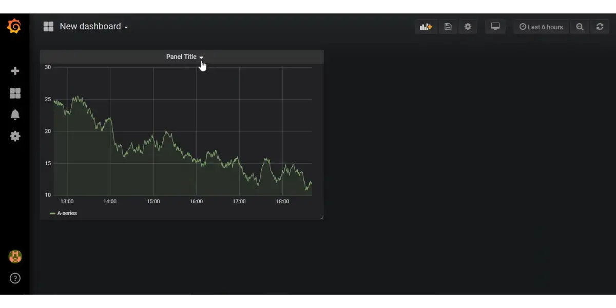
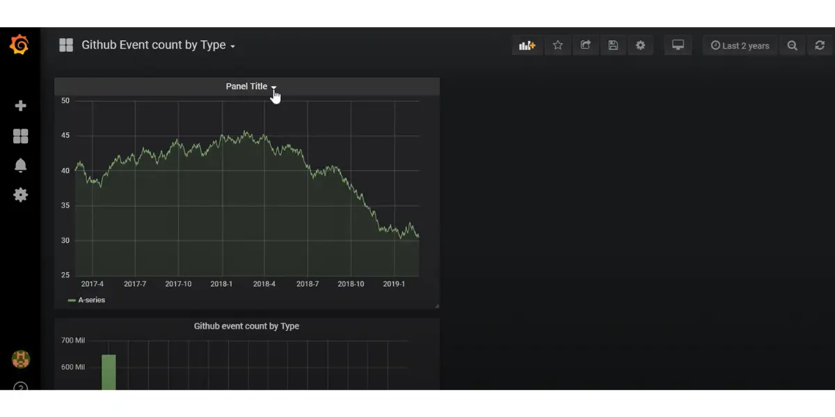
Some screenshots of Grafana
Likes
- Uncomplicated setup
- Substitute for pricey real-time dashboards
- Good visualization of data from any criteria
- Value for money
Dislikes
- Limited data visualizations, dashboards, and designs
- UI needs improvement
- The learning curve is tedious
- UI Lagging at times
Other details
| Deployment | Cloud, SaaS, Web-Based |
| Support | 24/7 (Live Rep) |
| Customer ratings | Capterra: 4.6 (38+reviews), G2: 4.6 (85+reviews) |
User opinion
This is an interactive data visualization platform that helps you interpret your data. It can visualize the data in various formats like charts, tables, or graphs and merge it into single or multiple dashboards, making it easier for you to analyze and track data.
10. Whatagraph
Whatagraph is a platform that helps businesses and marketing teams produce special reports instantly. They can use it to monitor and evaluate the marketing performances of in-house teams and clients. In addition, it creates attractive and simple real-time reports that can be shared with team members and clients.
Pricing
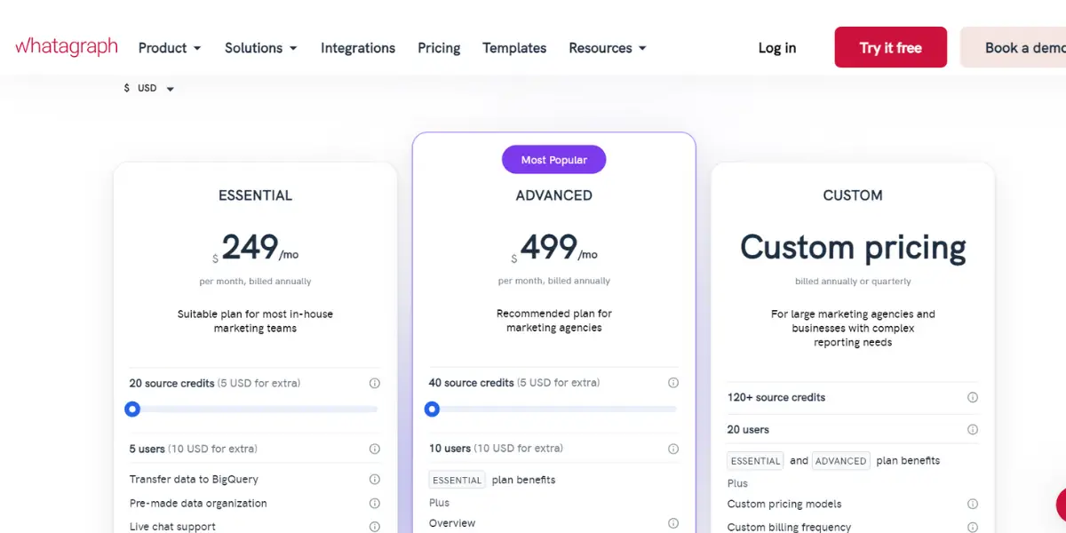
- Professional: It starts from $249 per month, billed yearly.
- Premium: It starts from$499 per month and is billed yearly
- Custom: For customized pricing, kindly contact the sales team directly
Features
- Connect sources and receive live data reports and automatic updates
- Creation of customized reports according to the sources
- Timely schedule of reports to be sent out
- Reports and dashboard
- Multi-channel tracking
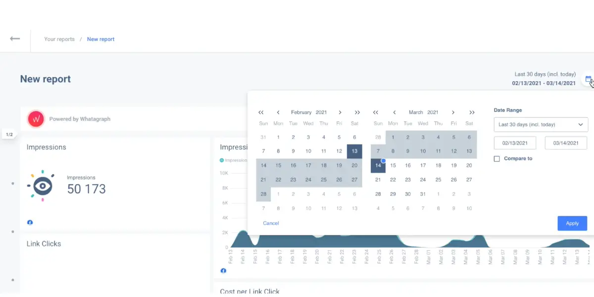
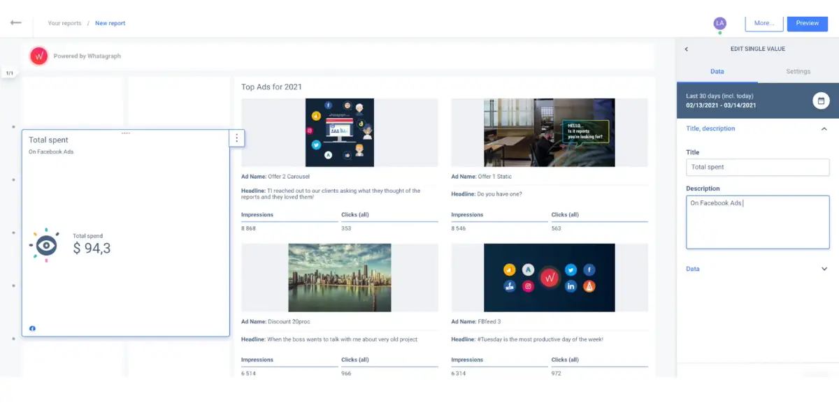
Some screenshots of Whatagraph
Likes
- Creating cross-channel reports
- Ready to use templates and widgets to create reports
- Easy to set up
Dislikes
- Pricing is high
- Limited integration tools and features
- Poor customer service
- UI has many bugs
Other details
| Deployment | Cloud, SaaS, Web-Based |
| Support | Email/Help Desk, FAQs/Forum, Knowledge Base, Phone Support, 24/7 (Live Rep), Chat |
| Supported language | English |
| Training | In-person, Live Online, Webinars, Documentation, Videos |
| Customer ratings | Capterra: 4.4 (78+reviews), G2: 4.5 (262+reviews) |
User opinion
This cross-channel marketing tool is useful in creating visuals and reports using data from different sources in your company. It can track, evaluate and analyze performance data with clients and your team. It helps simplify complex data for better understanding.
Conclusion
You must select the right software to create effective data visualization. Unfortunately, with so many options on the market, it can be difficult to determine which is best for your specific project.
This blog post has provided several options and the pros and cons. Be sure to consider all of these factors before making your final decision.
Reference